The language of protection
Our creative concept combines two worlds. The first reflects our technical expertise by using coding symbols to illustrate our messaging in powerful, unexpected ways. The second world is designed to be accessible to everyone. It portrays images not only from our business, but also from our life and our purpose.
Our bold typography and simple visual glyphs express confidence in the things we do. They push us forward into a future defined by positive energy and transformation.
The imagery interacts with the typography and visual glyphs, symbols from the coding language. In doing so, it wraps our brand‘s elements inside a protective cover.
Descriptor
Definition, size, and placement
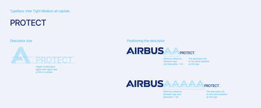
Airbus Protect only uses the descriptor size shown below.
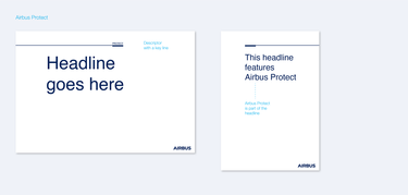
The ‘Protect’ descriptor name never appears on its own. It must always be accompanied by the Airbus logo or name. It may be used as an organisational descriptor. Alternatively, ‘Airbus Protect’ may be part of the headline or subline.
When writing ‘Protect’ in a sentence, it is preferably preceded with the word ‘Airbus’ eg. ‘Airbus Protect’.
The design element: ‘Intellicons’
Glyphs and symbols are key defining elements of the Airbus Protect visual concept. They are also an essential part of our communication. Evoking future-focused innovation and expertise, this special character set gives Airbus Protect communication a unique appeal and recognisable brand presence.
The Intellicons are used as part of our visual headline approach. They can be flexibly arranged to form a graphic supersign or image container. The symbols can also be used to frame bold statements or to create a photography container.
Glyph set definition and guidance
The defined set of glyphs and symbols should be used to create visual headlines that leverage a diverse set of messages:
- protection, shield, unity: brackets
- progress, moving forward, focused, future: arrow, sum
- mathematical symbols such as plus, minus, sum can replace words like ‛and’, not’, ‛to’, …
- punctuation signs to emphasise phrases, or to create large singular design elements for bold statements or photography containers
Important note: Only use glyphs from the Airbus corporate typeface Inter Tight Bold.
Don’ts
Please consider following these rules for best results:
- Avoid symbols like ̒@ € §%’. They have an alternative legal or very functional meaning (e.g. currencies, complex mathematical symbols).
- Avoid combinations that create a double meaning. No emoticons, please!
- Do not use a singular arrow or a singular slash as a supersign as these two symbols are very much associated with other brands (> for Accenture and / for Deutsche Bank.) If you want to use them, they should always be part of a sentence.
- Don’t use symbols from fonts or type weights other than Inter Tight Bold.
- Don’t overlap symbols.
Visual vs. corporate headlines: a systematic approach
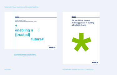
The visual headline style that we create with Intellicons is the key design element for Airbus Protect.
Visual headlines use lowercase letters only, and they are at least partially set in the accent colour Clear Blue. Visual headlines can be arranged flexibly – with lots of breathing room between characters. Symbol spacing and selection also should have a strong link to the actual message.
In addition to the general Airbus Tone of Voice, our messaging has to convey a future-oriented, optimistic mindset. Please focus on short and bold messages that reflect the confident Airbus Protect attitude.
Finally, use Inter Tight Bold for visual headlines. Inter Tight Regular or Light is preferred for corporate headlines or body copy.
Colour
The Airbus Protect colour palette includes two colours.
The main colour is Airbus Blue; the accent colour is Clear Blue. This colour gives the Airbus Protect brand a unique look and feel. As an accent colour, it is used exclusively for the visual headline and its symbols. Its crispness and clarity symbolise a positive, sustainable future full of energy and life.
Finally, white is used as the colour for inverse type.
Our business units colours
Photographic Style
Our imagery is simple, clear and reduced.
The predominantly light, slightly desaturated yellow-orange or pastel shades create a warm, likeable, and authentic tonality.
Image motifs can portray a diverse range of industrial sectors serviced by Airbus Protect. Our core topics are technology, IT and sustainability.
Applications
The sample applications below showcase the rich set of options that the Airbus Protect creative concept has to offer.
As flexible as it is scalable, the high-impact typography solution is easy to implement across a wide variety of formats and environments.
Now it’s your turn! See the images below for inspiration on your next layout and campaign.
-


Airbus Protect design application roll-ups
Airbus Protect design application roll-ups
Airbus Protect design application roll-ups
-


Airbus Protect design application posters with symbols
Airbus Protect design application posters with symbols
Airbus Protect design application posters with symbols
-


Airbus Protect design application presentation
Airbus Protect design application presentation
Airbus Protect design application presentation
-


Airbus Protect design application posters
Airbus Protect design application posters
Airbus Protect design application posters
-


Airbus Protect design application web
Airbus Protect design application web
Airbus Protect design application web


