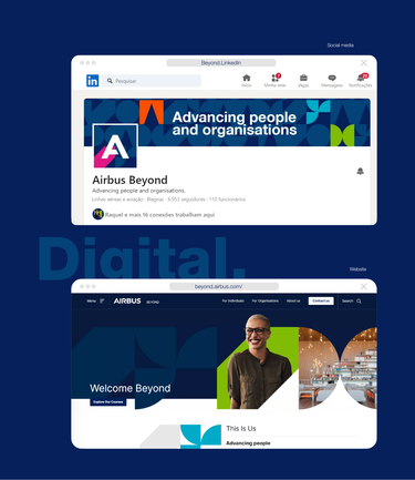
What do you need to know about Airbus Beyond?
Airbus Beyond has been developing aerospace professionals and organisations for over 30 years, based on hands-on training that stems from actual industry experience.
As the name suggests, the mission is to go further, embrace change and to collaborate with experts to provide industry-leading transformation that’s meant to help people grow in the aerospace field.
Descriptor
The “Beyond” descriptor should be positioned and sized with the Airbus logo as seen below.
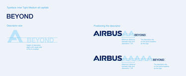
Airbus Beyond descriptor typeface, size and positioning
Always use “Beyond” together with the Airbus logo or Airbus written form. Don't use the “Beyond” descriptor by itself.
When writing “Beyond” in a sentence, it is preferably preceded with “Airbus”, e.g. “Airbus Beyond”.
We sound like Airbus Beyond
In line with the general Airbus Tone of Voice, we communicate with a blend of knowledge and optimism.
Our messages should be bold, smart, inspiring and forward-looking. Keeping our language simple and relatable is key, without oversimplifying.
Our personality
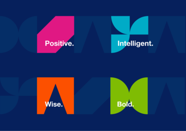
Airbus Beyond has a distinct personality that shapes all aspects of communication, leaving its mark not only on visuals but also in the written content.
Design elements
Our design shapes
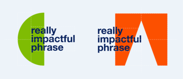
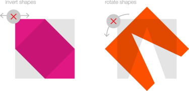
To visually represent our personality, Airbus Beyond uses a set of special design shapes. These shapes can be combined with typography or imagery to emphasize the message.
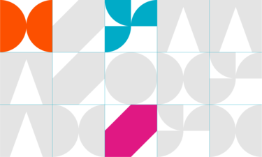
Our grid
Feel free to position the design shapes anywhere on the page, but follow the spacing grid.
Don’t forget to maintain a slight distance from the Airbus logo to ensure clarity and visual balance.
You have the flexibility to resize the design shapes keeping the same size for all. However, avoid reducing them below a certain size to maintain their visibility and impact.
Combining the design elements
There are four unique design shapes available for Airbus Beyond.
You have the option to use one or more of them, depending on your preference and the message you want to convey.
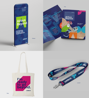
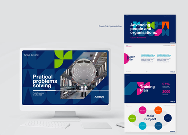
To enhance the visual impact, you can combine these design shapes with either typography or images.
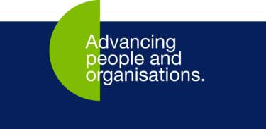
Layout example combining shape and typography

Layout example combining shapes, typography and images
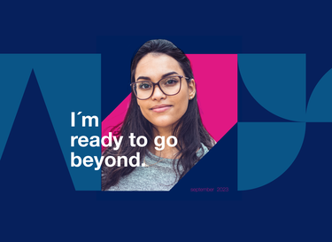
Layout example combining shapes, typography and image
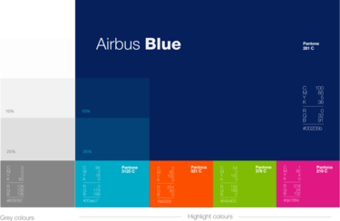
Our colours
Following the Airbus colour palette, Airbus Beyond uses a selection of colours detailed in the image below.
Photography
Our primary objective when using photographs is to capture real moments, whether they depict individuals or groups, in natural settings like offices or classrooms.
Our aim is to communicate authentic experiences that connect with our audience.
