Introduction
The key line is one of the basic graphic assets building our visual identity.
Whilst being a recognisable Airbus graphic element, the key line will help to structure the layout. Either the step or the end of the key line should be aligned with the placed text.
The key line:
- Should never be associated with the Airbus logo but is there to graphically punctuate a headline or a text block.
- Should preferably run into bleed (if only one end runs into bleed it has to be the fine end).
- Can be used in all colours defined in the palette.
- Can be mirrored horizontally but the step has to be orientated downwards.
- Can be used vertically but the step has to be orientated to the right.

Key line proportions and positioning the step
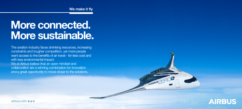
Application examples
-


-
-


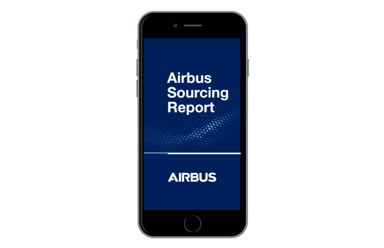
Airbus Digital visual identity title slide with key line
-