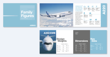
Logo placement and size
All brochures and leaflets we publish must figure an Airbus logo on the cover page.
The logo is always positioned in the lower right corner of the cover.
The distance to the lower and right page border is proportionate to the logo’s size as shown in the adjacent diagram. This principle is applicable to all document formats.
Both the logo size for the different DIN formats and other in-house sizes are detailed in the table below. The logo size is the same for portrait and landscape formats.
For other formats, use this simple formula: smallest side of document divided by 30 equals the height of the wordmark of the logo.
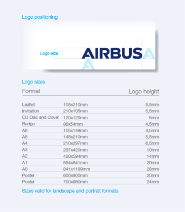
Logo positioning and sizes on different formats
Title block
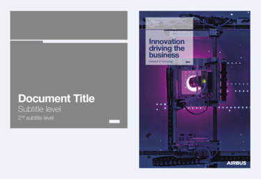
The title block is one of the basic graphic assets building our visual identity.
It is the basis for all cover layouts and enables information to be ranked clearly and stand out properly.
It contains the title and other related information, leaving maximum space for pictures and illustrations.
The title block is applicable to all printed collateral.
Definition of the title block
This illustration shows how the title block shape is defined for an A4 size document.
For other page sizes the shape is scaled proportionally. For exact dimensions refer to the table on this page.
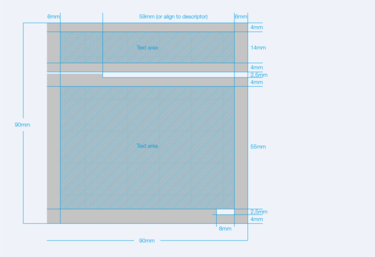
Dimensions of the title block
Font sizes and definitions
When filling the title block with text, the defined fonts and font sizes have to be applied.
Only the title is variable in font size. A minimum size is defined, the maximum size depends on the space available in the text box. The shorter the title the bigger it can be displayed.
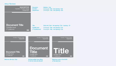
Font weights and sizes on the title block
Title block sizes
There are title block sizes and the corresponding font sizes defined for every document format.
You will find these for the standard document sizes in the below chart, and for non standard sizes you have to interpolate.
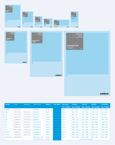
Title block sizes and font sizes defined for every document format
Positioning the title block
The title block is placed on the cover photo but it should be avoided to cover the main subject of a photo.
To keep flexibility that allows us to take full advantage of our existing photo stock, we have defined an area, within, the title block can be placed freely. The title block area consists of the upper 2/3 of the cover page excluding the margins.
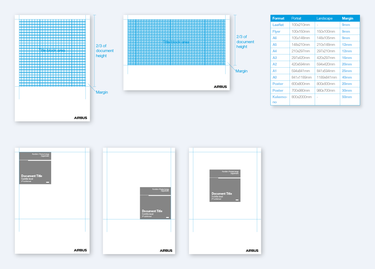
Defined area to position the title block
Applying descriptors in the title block
When using a descriptor, the thick part of the key line in the title block is adapted to the length of the descriptor in order to align these two elements.
The Commercial Aircraft descriptor should only be used when the publication content is product related.
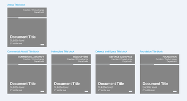
Overview of title blocks with descriptor
Application samples
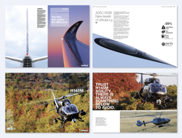
These examples show how to make best use of existing stock photography by placing the title block on different positions.
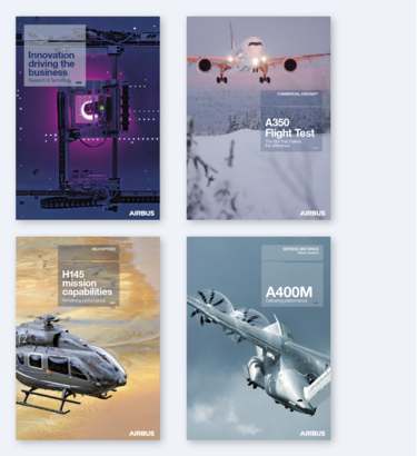
Title block on brochure covers
Layout grids
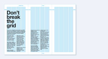
Grids are essential to maintaining a uniform, organised layout in all brochures and publications.
This page shows the grid system for our most common publication formats.
The text must always respect and be contained within the grid frame. Only solid colour boxes and pictures may extend beyond the grid border.
Size for body copy:
A4 brochures: 10pt or 11pt
Documents smaller than A4: 9pt to 11pt
Pagination:
The pagination consists of a three digit page numbering, a vertical stroke and the title of the brochure (optional). The pagination must be placed at the top outer corner of each page following the principle shown the margins as shown.
A4 portrait
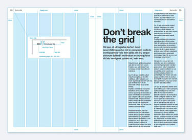
A4 portrait layout grid
A4 landscape
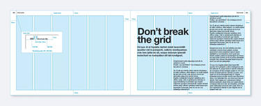
A4 landscape layout grid
A5 portrait and landscape
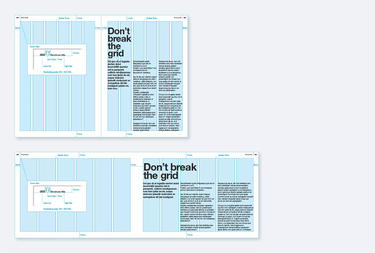
Layout grid dimensions for A5 portrait and landscape brochures
Leaflet DL
