Descriptor
Size and positioning
Placement on the website
In combination with a green block
Written, without logo
Block grid
The Block grid represents the complexity of cyber activity. It represents the logical, complex processes broken down into simple parts. It also represents the excellence that CyberSecurity provides in the areas of Prevent, Protect, Detect, Respond.
The master template is the visual resource for the graphic language of CyberSecurity. This is the complete template, however you have the flexibility to select any section of it that you require. All formats are contained within it. Any section of the master template can be selected for your chosen format. Block elements can be scaled to fit.
Using the block grid is optional.
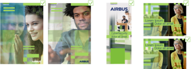
The Block grid in use – Dos
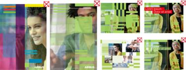
The Block grid in use – Don'ts
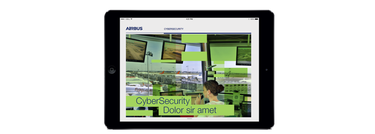
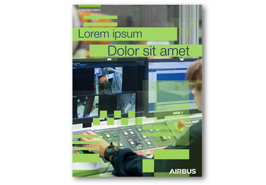
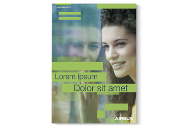
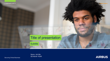
These examples demonstrate how the sections of the Block grid have been overlayed on imagery.
Adjust the individual opacity of the sections within the grid to reveal the most important parts of the image. Use only increments of 20% opacity when playing with the layering effect. You may use ‘multiply’ layer effect if desired.
Logo: Do ensure that the Airbus logo is respected. The grid may overlap with the logo, but ensure that the treatment is clean and considered.
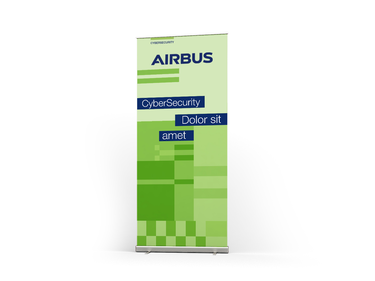
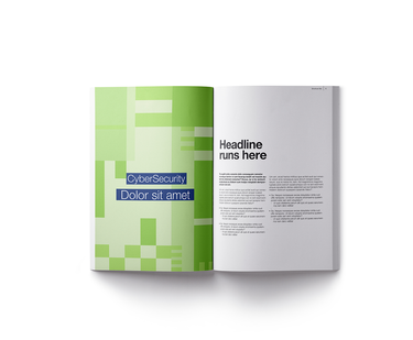
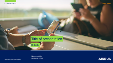
To ensure maximum legibility, a colour bar is placed behind the text. The bar should be 100% CyberSecurity Green with NO transparency or opacity applied. The text should be in Airbus blue.
There is freedom to decide upon the placement and size of the headline, to create a balanced layout. The depth of the bars should be 150% height of the type. This will ensure the ascenders and descenders of the type are contained in the bars.
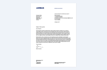
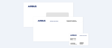
Stationery
Photography guidelines
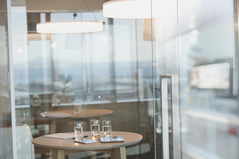
CyberSecurity is all about protecting environments. In our photography, windows are always a visual component of the image. Windows represent the ‘invisible protection’ that CyberSeurity provides. The reflections on the glass ‘make the invisible, visible.’
Photography guidelines – Dos
- Images of people at work show them engaged with an activity, or in a professional space.
- Ensure that the people represented are from a diverse range of backgrounds.
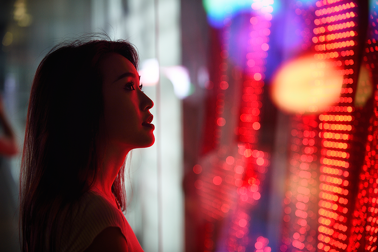
Photography guidelines – Don'ts
- Avoid visual cliches when capturing people at work, or teamwork moments.
- Avoid staged, posed pictures. Images should capture natural moments.
- Do not use images with artificial light, or dark images. All images should be shot in natural daylight.
- Do not select images that only show windows. The image does not have meaning without context and narrative combined.
- We do not show the problem, we show the solution.


