What is the anniversary system?
Markets can now celebrate the presence of Airbus within their country, and mark key anniversaries with a bold graphic announcement.
This key visual announcement can be used across a number of touchpoints. However, there are strict guidelines to creating this key visual to ensure we maintain the correct tone that fits the Airbus brand. These rules are captured below.
The key visual
A clean, simple typographic layout has been crafted to allow a bold message to be used easily. We will use the example from the Philippines to illustrate the system.
Vertical lock up
Inter Tight Bold is used for all the type in the key visual. The number of years is the hero. Ensure this is the largest element in the lock up. The number should be scaled to fit the column width of the type below it. Airbus blue is the only colour the key visual should use.
DO change the year and country name as required. Keep to the same alignment.

Vertical lock up of the key visual
Horizontal lock up
The same rules apply for the horizontal version as for the vertical version. The only difference is the arrangement of the type. The number is still the hero but should be scaled to fit the column height of the type alongside it.

Horizontal lock up of the key visual
Minimum size
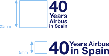
The minimum size use for the vertical lock up is measured with the height of the lock up and is 25 mm.
The minimum size use for the vertical lock up is measured by the height of the number and is 5 mm. This is the recommended version for small scale applications.

Minimum size for the key visual
Photographic key visual
The key visual has been integrated with Airbus photography to be used in communicative media. The lock up is always used in a heroic way, by scaling up to fill the canvas area for maximum impact. Maintain a comfortable margin to allow for breathing space as shown.
- Take a full bleed image, and place the Airbus logo in the correct position in line with the brand guidelines.
- Place the key visual in the centre of the image and scale up to dominate the image area. All text except the numbers must be white.
- Copy the background image and mask it inside the number. Move the image within the number frame to ensure visibility of the image and legibility of the number. The image must be the same as already used in the background.
- Take a 20% tint of white into the number area to soften the contrast of the image inside the number.
- Images should only be aerial shots depicting built up areas of the country. No products should be shown.
- Ensure the imagery has soft tonal contrast for best legibility with key visual.

The key visual integrated with photography
Examples
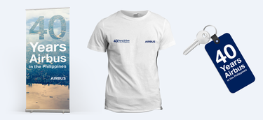
The following examples demonstrate how the key visual can create impact on touchpoints for corporate and commercial use.
