Introduction
Our icons have a defined unified design style so they match with the Airbus graphic environment.
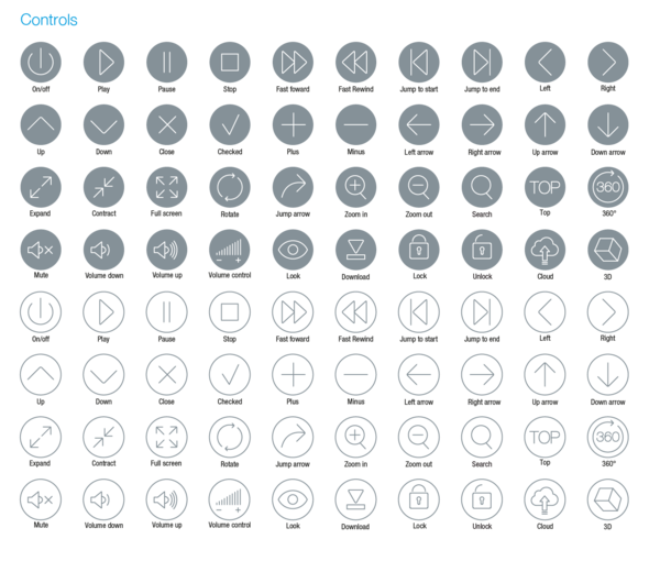
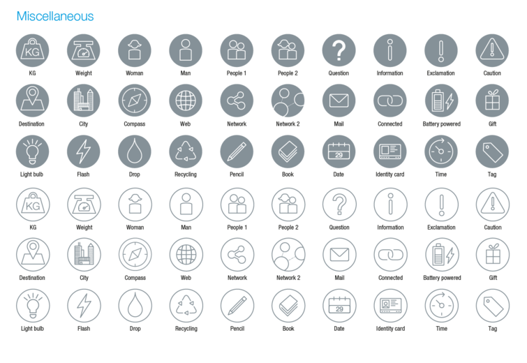
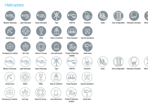
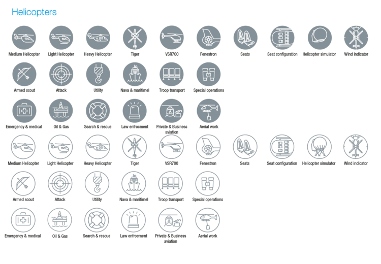
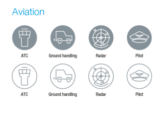
We have created a huge range of icons for many generic and specific themes.
The Airbus icon set is ready to download from this page for office applications and Adobe Illustrator, it is also contained in the Airbus advanced Google slides templates.
If you can’t find a suitable icon for your requirement, you can create a new one following the design principles detailed below.
Please always consider:
- Icons are not logos and not to be used as such.
- Icons are generic and not specific, which means that they have to be understandable and usable by all.
- Icons do not contain text, icons usually accompany text.
- An icon is not an illustration, it will never be able to express complex contents. If you wish to do so consider developing an illustration and use explicative text.
Design principles
A basic set of principles are followed so all icons are consistent and recognisably Airbus. The design is formed from a basic outline with only necessary details.
Create direct representations obvious associations
When possible create a direct representation such as: mobile phone = mobile phone
When an icon can’t be represented directly we use an obvious association to the subject, for example: a snowflake = cold.
When creating a new icon, please share it with the branding team:
We can support you to apply the design principles and then we can add it to our library so other people can use it.
Flat and outline icon
Application: Flat icons
Design
Icons need to be simple. Start with a basic outline and apply only the bare minimum of detail necessary for recognition.
Line weight
There is only one weight of line used. Icons have to be designed at 50 mm diameter with 3 pt line weight.
Exclusion zone
Shown exclusion zone is fixed. It should be used for a clear display whenever possible.
Spacing
The spacing in between lines should be equal to the weight of the thicker line.
Curved corners
Set a small corner radius when possible to make the icons look smooth. Stroke corners have always to be set on “round join”.
Creating a flat icon in four steps
Application: Outline icons
Design
Icons need to be simple. Start with a basic outline and apply only the bare minimum of detail necessary for recognition.
Line weight
There is only one weight of line used. Icons have to be designed at 50 mm diameter with 3 pt line weight.
Exclusion zone
Shown exclusion zone is fixed. It should be used for a clear display whenever possible.
Spacing
The spacing in between lines should be equal to the weight of the thicker line.
Curved corners
Set a small corner radius when possible to make the icons look smooth. Stroke corners have always to be set on “round join”.
Creating an outline icon in four steps
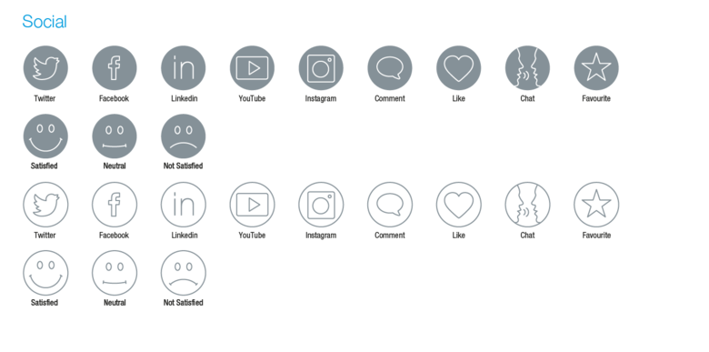
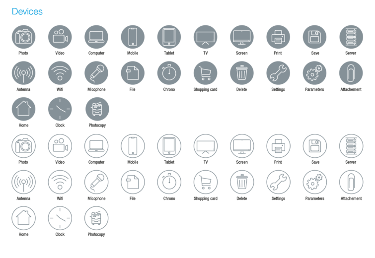
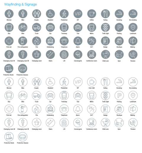
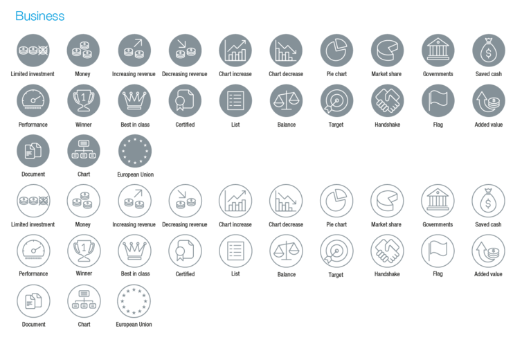
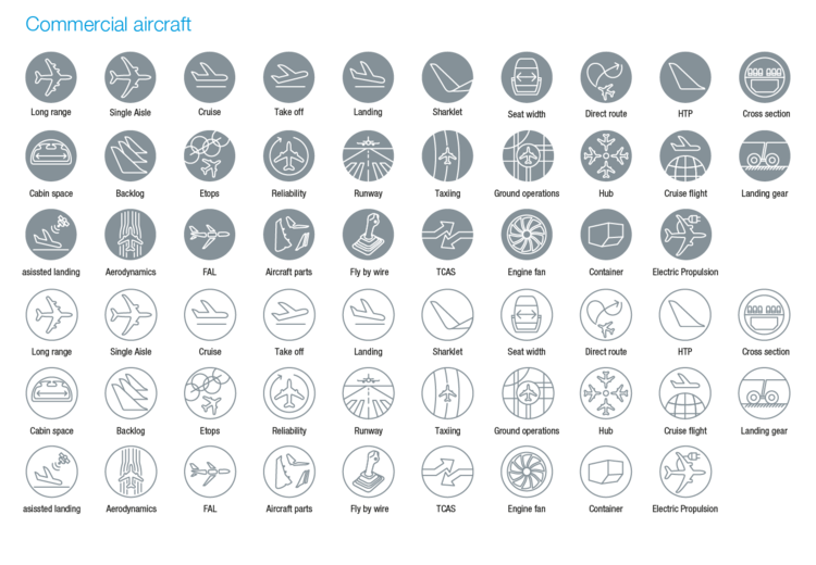
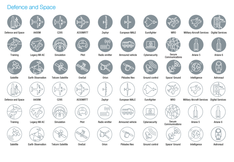
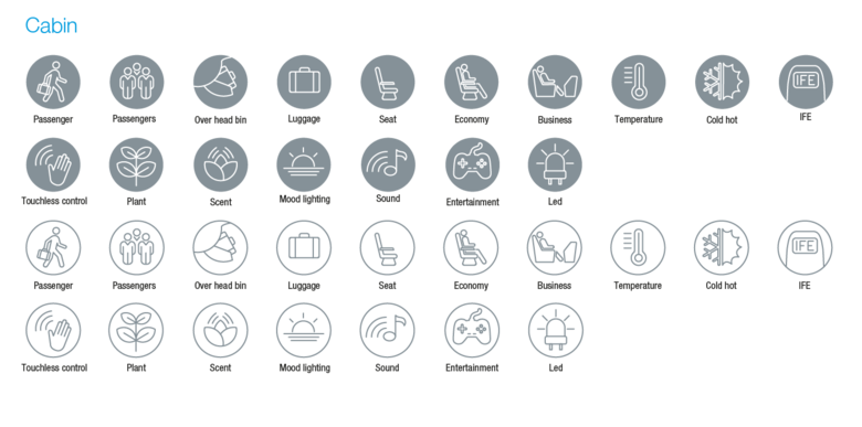
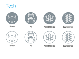
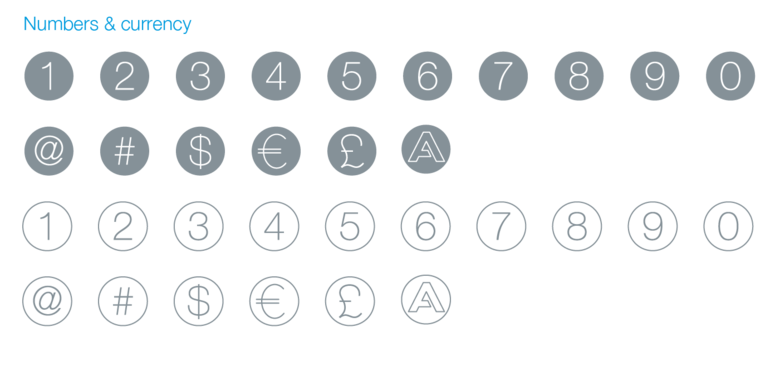
The Airbus icon set
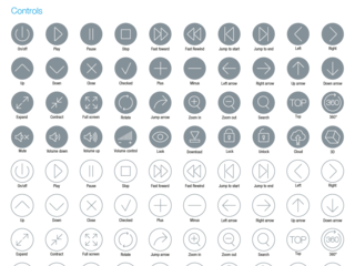
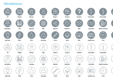
A dedicated icon set for the visual identity covers the most common needs.
All colour palettes can be used.
Best practice

Infographic using an icon
Website using an icon
Brochure layout with an icon
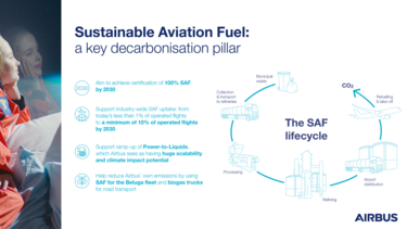
Infographic using several icons
