Introduction
Navigation from place to place is a fundamental human activity and an integral part of everyday life.
Where are you? Where are you heading to? People use their knowledge and previous experiences to find their way in the build environment.
Way-finding has the function to inform people of the surroundings in the (unfamiliar) build environment, it is important to show information at strategic points to guide people into the right directions.
When creating signage please apply the following principles:
- Do not make people think:
Create a comprehensive, clear and consistent signs with concise messaging that can be understood at a glance.
- Show only what is needed:
Display only the information which is relevant to the space, location and / or navigation path. Remove excessive information.
- Brand it only if necessary:
Not every sign needs a logo, many signs have only an information function such as way-finding signs, security signs, …
- Brand only
We do not promote functions, products, services, initiatives or use our buildings as advertising space. Our buildings are Airbus only, our guests and visitors come to Airbus first, then to a specific place. Anything else than the Airbus logo on a building facade contributes to brand dilution.
Specifications
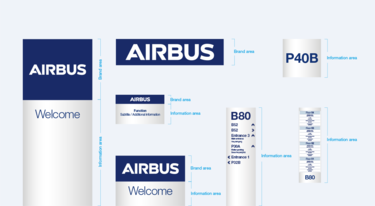
Airbus signs have a brand area and/or an information area:
The logo is always displayed in the brand area in white on blue background. The sizes of the brand areas are always defined in proportion to the logo size.
The information area is in matte aluminum/silver with blue text and graphic elements.
Signage overview
Typeface
To keep consistency and clarity, the typefaces used on signage are reduced to two.
Inter Tight Bold and Inter Tight Light
Text is always written in sentence case or title case – no uppercase.

Inter Tight Bold and Light
Colours
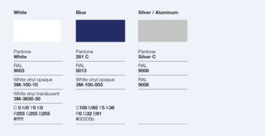
Colours to be used are blue, white and matte silver/aluminium.
Signage colour palette
Icons
Only commonly used icons (e.g. rest room, smoking area etc.) that are not site/department specific should be used.
Icons should only stem from the existing icon set.
Alignment with brand management is necessary when new icons are needed.
Signage icons
Sites and buildings
Totems
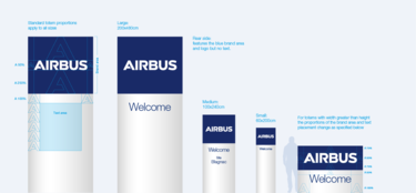
Totems signal the entrance of our sites. They should be placed only at main entrances where we expect visitors to come and can be welcomed.
They are mainly to display the brand and should have the minimum amount of information possible.
Various totem sizes

Totem front view, side view, rear view and structure
Wall mounted signs
Wall mounted building signs should be placed with parsimony and strategically to be seen from outside our sites or in places where our customers are regularly.
The aim is to show our presence but not over-brand our sites.
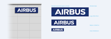
Wall mounted signs standard sizes
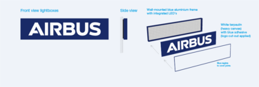
Wall mounted signs lightboxes
Glass facades
Signage can be applied directly on glass facades of buildings, taking advantage of the space available on a building itself.
In this case, no additional signage structure is needed.
A percentage of the size of the Airbus “A” defines the margins to be applied around the logo.
This signage must only be in white.
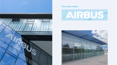
White Airbus logo on glass facades
Way-finding outdoor
Circulation
Circulation signage only carries way-finding information and will therefore stay unbranded.
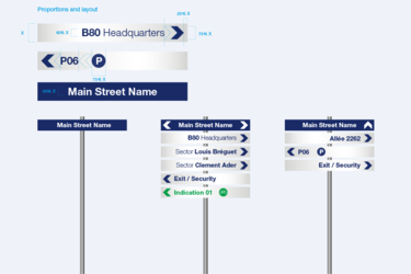
Circulation signage proportions and layout
Totems
Totems that identify main buildings with potential visitor interest and/or carry special information for these are branded.
Way-finding totems will stay unbranded.
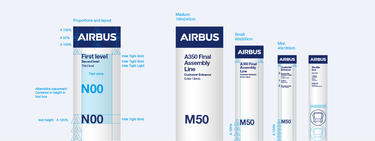
Branded wayfinding totem proportions, layout and sizes
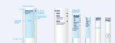
Unbranded wayfinding totems proportions and layout
Building identification
Building identification and information signs do not carry any branding.
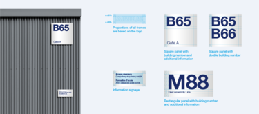
Building identification proportions and layout
Glass doors
In addition to the mandatory stripes on glass doors, a logo can be applied where necessary.
These markings must only be in white.
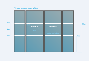
Principle for glass door markings
Flags
Our flags come in a vertical and horizontal layout. The vertical version is the preferred. Flags must not carry any additional text.
For protocol occasions please use the vertical flag.
The horizontal flag is only used for promotional purposes.
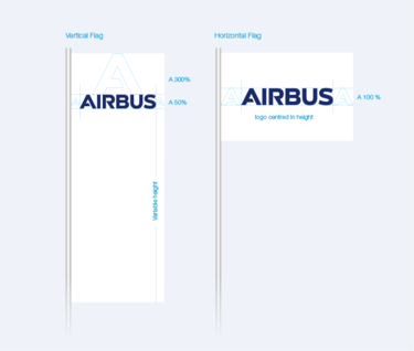
Vertical and horizontal flags with Airbus logo
Way-finding indoor
Welcome desks
Welcome desks can be branded with an Airbus logo in single 3D letters directly on the wall or single letters applied on a sanded glass support.
The logo can be applied in blue or white, depending on the background.
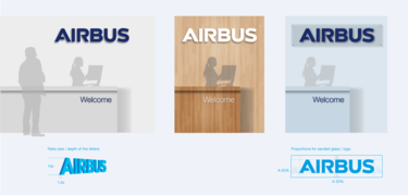
Welcome desks with Airbus logo
Wall mounted signage
Indoor way-finding and office identification should only be branded if really necessary. In general, one branded sign per floor should be sufficient.
The information displayed has to be useful for internal and external visitors and needs to be kept as simple as possible.
Please keep in mind that this is way-finding information and not an organisation chart.
Information should be reduced to indicate:
- Function
- Main departments (only first level within function)
- Office numbers
- Meeting and Videoconference room numbers
- Other public rooms or areas
Do not display:
- Siglums
- Names (only on Office identifications)
They do not help orientation.
Door signs are not part of the standardised templates
The reason is that the signage is not standardised worldwide, but is established by the local site and security organisations.
As a rule, no Airbus logo is used on the signs unless the Airbus offices are located in an area where other third party companies also have offices and a clear demarcation is required. Otherwise, Airbus offices are usually located in a building that is already clearly branded as an Airbus site and the signage for each office only shows the numbering according to the building and space structure that has been established for that site.
If you need a door sign, please contact your local facility management.
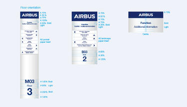
Branded floor wayfinding signs proportions and layout
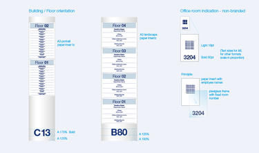
Unbranded floor wayfinding signs and office room indication proportions and layout
Working stations
Working station identification is purely informative signage and therefore not branded.
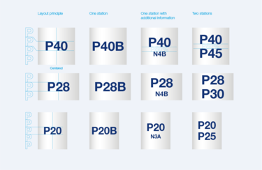
Working stations proportions and layout
Videoconference rooms
Videoconference room identification is done with branded signage displayed in the field of view of the camera. In addition to the logo the site is added.
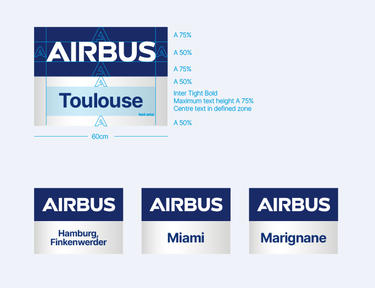
Videoconference room identification proportions and layout
Shared sites
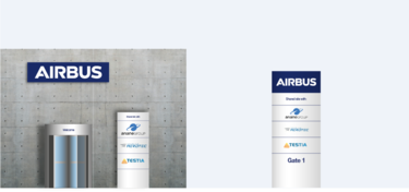
On Airbus sites that include subsidiary or subcontractor companies, these can be mentioned at the entrance as follows:
Main building entrance:
In addition to the wall mounted Airbus sign, a totem mentioning “Shared site with:” and the relevant company logos can be installed.
Secondary access gates:
Totems will be shared when possible. Relevant company logos appear below the mention “Shared site with:”.
The maximum size of the company logos should be 60% of the size of the Airbus logo.
Way-finding signage should not be branded other than Airbus.
