Logo size and positioning
Positioning
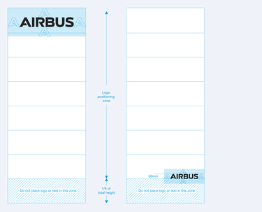
The logo positioning depends on the purpose of the roll-up banners.
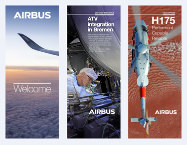
For branding focused roll-up banners (mainly external usage) the logo is to be positioned on the top of the banner to guarantee its good visibility.
For topic focused roll-up banners (mainly internal usage) the logo can be positioned in the lower part of the banner to give space and importance to the illustrated subject.
The logo can be positioned anywhere in the defined positioning zone which is the upper 7/8 of the roll-up banner. The logo should never be positioned in the lower 1/8 of the roll-up banner.
The logo should either be right aligned with the border (respecting the exclusion zone) or be centered.
Size
The logo size on roll-up banners is variable. The maximum size is limited by the logo exclusion zone, the minimum size is fixed at 50 mm height of the A of the logo.
Layout
Layout
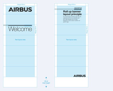
Alternatively, roll-up banners can also use layouts with the key line. The key line height is fixed to 12 mm. The distance between key line and title is defined by the font size (one lower case letter). Titles and body copy can be set in any of the Inter Tight fonts that are defined in the Typography guidelines.
Text sizes
Both, headline and body copy type, are variable in size.
Margins
The top, left and right margins are set fixed at 60 mm.


