Overview
Illustrations reach from simple product or item illustration to more complex context illustrations. It is important to keep the style consistent as the result should be a scalable system.
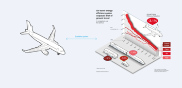
Example scalable illustration system
Product and technical illustration
Product and technical illustrations should be kept in a simple line style.
Apply two stroke weights as outline, the thicker stroke should be double weight of the thin stroke.
Limit to one fill colour from the Airbus colour palette for accentuation.
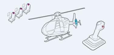
Airline seats, helicopter, flight control stick
When illustrations are applied on coloured background make sure to create a good contrast for the outline and accentuation colour.
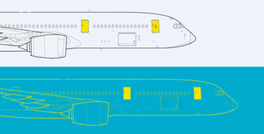
Aircraft
For more complex illustrations, stroke weights may vary to create more levels of differentiation.

Satellite
Context illustration
Stroke weights may vary to create more levels of differentiation.
Apply up to three fill colours from the Airbus palette.
Use continuous lines for the annotations and dotted lines to display technical connections or communication between elements.
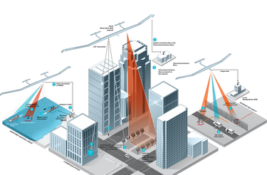
Zephyr UAS infographic
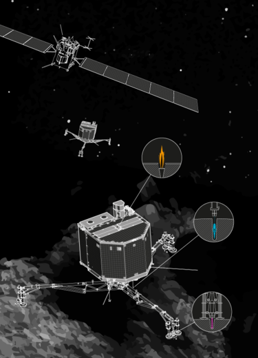
Satellite infographic

Aircrafts on runway
Characters design
For more information about characters design, please visit the Motion design chapter
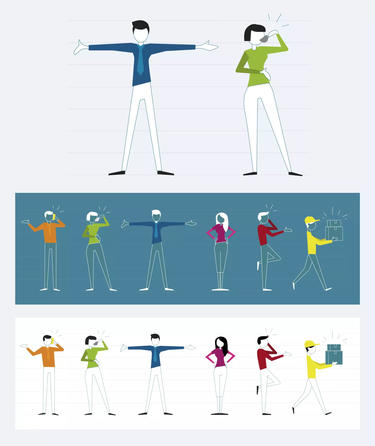
Sample of the Airbus characters design
Don'ts
Don’t use hand or comic drawings.
Don’t use different illustration styles and mix them.
Don’t use several highlight colours when not necessary on one page.
Don't develop or use any mascots.
