Introduction
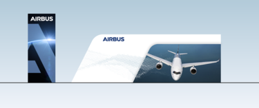
Trade fair stands are an essential tool to represent our company. Therefore it is essential that stands of Airbus and its divisions conform with the brand guidelines and feature following main characteristics:
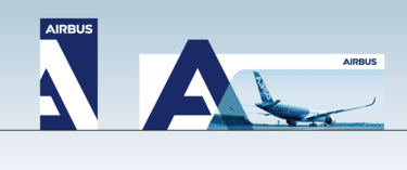
- A big "A" to set a more affirmative presence
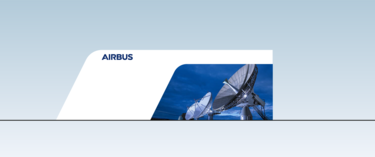
- The flight line becoming the basic shape of our architecture
- Open and transparent architecture linked to the Airbus visual identity
- Clear and reduced
- Bright and pleasant ambiance
- Focus on products and messages
- Integration and unifying character
- Airy and playful
- Combination of emotional flow and geometric simplicity
- Dynamic and modern
- Flexible and modular
When all the elements of our brand toolkit come together, they create a recognisable visual language and consistent brand voice.
The stand-alone A of Airbus is only reserved for limited purposes – for the exhibition stand, the advertisement campaign and as avatar for social media. No other use is allowed.
The big "A"
Usage
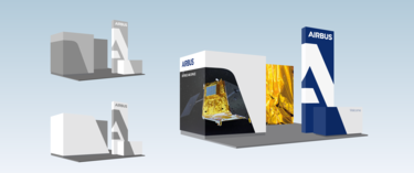
The big "A" is there to set a landmark and show a more affirmative presence of Airbus.
It does not replace the Airbus trademark and might only be used with the Airbus logo in proximity.
- Only one big "A" per booth
- The "A" can be solid colour white or Airbus blue and show transparency effects in combination with a photo
- The "A" can be cropped, but has still to be recognisable
- The "A" can be done in volume with depth
Sizes
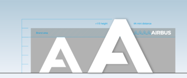
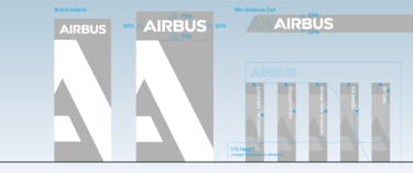
There are two sizes to apply the big "A". Privilege the bigger size when possible.
Whenever possible apply the big "A" as a cut out shape with a small distance to the wall. Alternatively it can be applied as simple adhesive flush with the wall as a less expensive solution.
Overlap and transparency
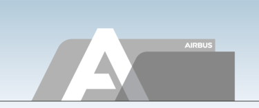
The "A" can overlap onto different elements and with that, effects of transparency and volume can be created.
The flight line
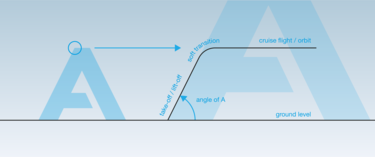
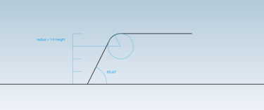
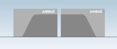
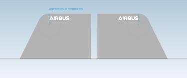
The flight line is the shape which makes our booth architecture distinctive. Proportions of height and rounded top corner as well as the inclination angle have to be kept as defined.
To find the right dosage and maximise impact following rules have to be respected:
- It is only applicable on full height walls
- It can be a physical shape or printed shape
- It should be considered and applied as an architectural feature – not as a decorative feature
- Do not multiply the usage of the flight line – favour a few significant applications
Please refrain from designing or using other shapes than the flight line to keep coherency in our exhibition style.
Flight line explained
The flight line construction
Wall layouts
Applied to a wall, the flight line creates shapes on a rectangular wall, or can become the shape of the wall itself
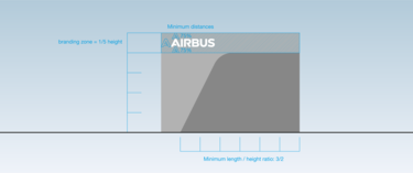
These shapes should have a minimum length/height ratio 3/2.
The flight line is only applied on full height walls and elements; on lower elements only the angle is applied without the rounded top corner.
The flight line can be mirrored on a vertical axis only.
The branding zone on the top always stays free from any graphic elements and hosts the logo in the defined size.
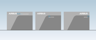
Descriptor application on walls
The division descriptors are applied either in the brand area or below the flight line in the defined size.
Totem layouts
A totem can replace a suspended logo banner/structure.
Small totems can figure descriptors of our divisions, business sectors, subsidiaries or joint ventures.
Product display pedestal shapes
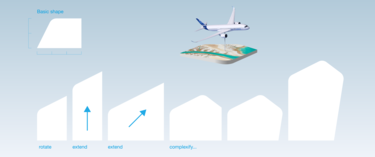
- All pedestal shapes are to be based on the basic shape which can be rotated, extended and combined
- Only the corners with the 62.42° angle are rounded, the radius should be constant between 30 and 40 cm
- All shapes must have a minimum of 2 sharp angles
- Product pedestal can be decorated with satellite or aerial photos
Welcome desks
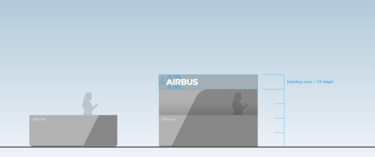
Welcome desks should have a simple clear shape. A blue area is applied with the angle of the flight line.
Marking should be restrained to a simple "Welcome".
Graphic samples
The following examples show how to bring the layouts to life with photos and some carbon grid.
Partnering up with Airbus subsidiaries on a stand
In this case we distinguish between Airbus branded subsidiaries and subsidiaries with independent branding.
Airbus branded subsidiaries:
They will appear with their descriptor in a dedicated zone/area and integrate seamless in the stand design.
Subsidiaries with independent branding:
In a general manner it is always preferable to have an Airbus stand only.
If a subsidiary with its own brand participates on an Airbus booth, they are not entitled to have their brand displayed on the stand. The subsidiary brand can only appear through marketing material that is either printed or displayed on a screen. The subsidiary name can be displayed as a descriptor on a small totem or a wall in the dedicated zone/area.
