Introduction
It is key that Airbus audiovisual productions are identified as such by our audience. To make sure this is the case, branding and graphics applied to audiovisual productions need to be overall coherent.
This consists of movie intro, outro as well as text animations, captions and subtitles. Only the use of the outro is mandatory. The intro can be used additionally.
Short clip on how to position text in videos
Branding assets
Branding assets used for audiovisual productions are:
1. Logo in available colours Blue (R0 G32 B91), White and Black variants. The Airbus logo is mandatory on each audiovisual production.

The Airbus logos for audiovisual productions
2. Typography: Inter Tight is used for all productions and Arial is used for subtitles. Please visit the typography chapter on the Brand Centre.
Typeface
Inter Tight is the typeface of choice for any item marking. You can use the styles from Thin to Black, but don’t combine more than two styles or use any Italic styles. If a product designation logo exists it may be used, but do not create any new logo.

Typeface and product designations
3. Graphic element: Key point
This is a basic graphic asset applicable after titles, captions, keywords, names and jobtitles, and thumbnails.
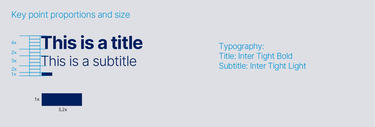
Graphic element key point
Intro (optional)
Intros with titles and without titles are identical for all Divisions.
Generic openers are typically used for
- News
- Interviews
- Illustrative animations
Two options for Intros without titles:
- With Filter: You can start with a blue filter made up of 100% Airbus blue up to the image without the filter.
- Without Filter: The intro to your video will be the first images of your video.
The images/videos extracts shown are examples only and should be replaced with images from your video.
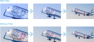
Optional intro for audiovisual productions
Generic intro with title
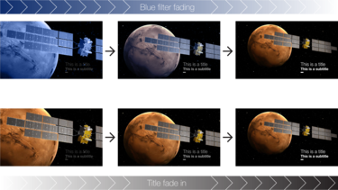
Generic intro with title for audiovisual productions
Titles on videos must be used in accordance with the text layout guidelines below.
Text layout guidelines
Positioning, colours and fonts to be used for titles, captions and keywords.
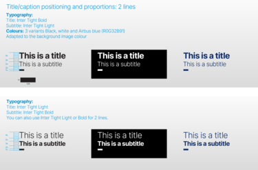
Title and caption positioning and proportions over two lines
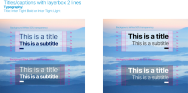
Titles and captions with layerbox over two lines
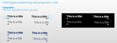
Title and caption positioning and proportion over one line
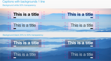
Captions with backgrounds over one line
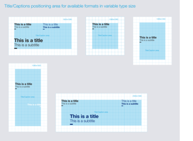
Title/caption positioning area for available formats
Two options available:
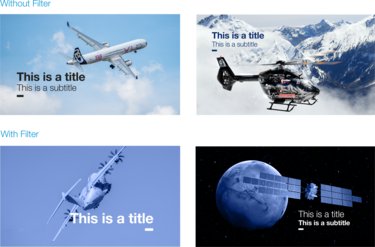
Title/caption with or without filter
Name/Jobtitle, Captions/Keywords
Three colour variants are available for captions, keywords, names and jobtitles. Black, white and Airbus blue in two versions, with and without layerbox in one or two lines.
Name/Jobtitle
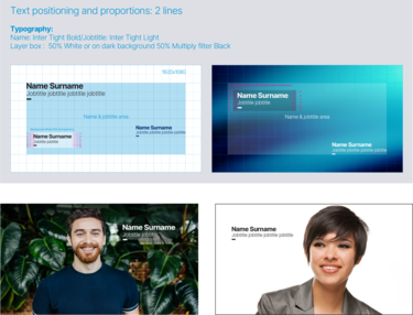
Name/Jobtitle positioning and proportions
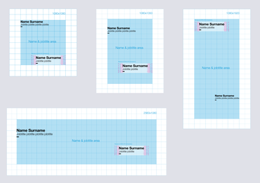
Name/Jobtitle layout area
Captions/Keywords
Please refer to the text layout guidelines part above when you add your text on videos.
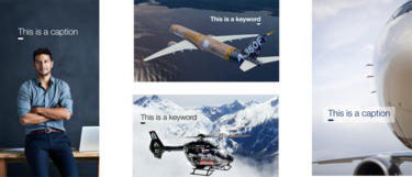
Captions and keywords layout examples
Subtitles
The application of subtitles is identical for all kinds of films. The text should preferably be placed at the bottom of the video, in Inter Tight Regular or Arial, with the option of adding a drop shadow.
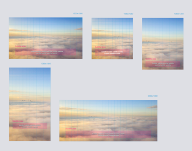
Application of subtitles for audiovisual productions
Outro
It is mandatory to use one of the defined endings. You can choose the generic version available in three colours:
- white Airbus logo on Airbus blue background (R0 G32 B91)
- white Airbus logo on black background
- blue Airbus logo (R0 G32 B91) on white background
Use the version that best suits your video. These endings are identical for all Divisions.
Transitions:
- crossfade on storytelling videos (products)
- faded to black on interview videos

The Airbus logos for audiovisual productions

Airbus logo positioning and proportions in the outro
Corner bug
Optional branding
Films that are not displayed within an Airbus context should be complemented with a corner bug.
Exclusion zone
Our logo must always be surrounded by clear space.
To regulate this, we have defined an exclusion zone equal to the size of the Airbus “A” around the logo as illustrated. It is important to keep this zone around the logo clear of any graphic elements.
Size
The size of the logo depends on the height of the screen. The height of the logo is always 1/18 the height of the screen.
Colour
There are two colour options: the white corner bug (60% opacity) should be used for coloured and dark images, the black corner bug (15% black) is used for very bright or white background images.
Application
The Airbus logo watermark should appear throughout in the top right hand corner of the screen as indicated. It should mix on after the opening titles have finished and fade off before any closing title sequence begins. If there is no closing title sequence, the watermark logo should match the end picture edit (i.e. cut or fade).
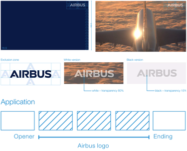
Films with a corner bug
Video thumbnail (YouTube)
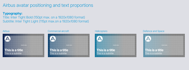
Airbus avatar positioning and text proportions on video thumbnails
Videos templates are available on demand.
Please visit the Audiovisual and Visual Content page on the Airbus Hub or e-mail: audiovisual@airbus.com