Introduction
The carbon grid is one of the basic graphic assets building our visual identity.
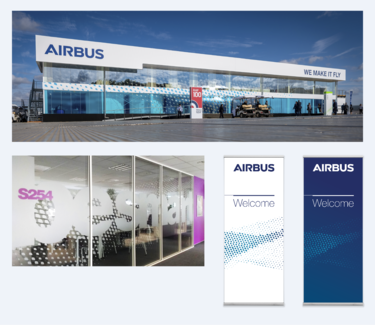
It can be applied to any Airbus layout and enables an even more unified look and feel.
The carbon grid can be used on plain backgrounds, or even interact with photography or typography.
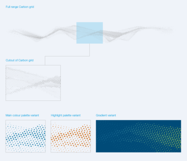
The full range is a wide wave of rasterized points, it is recommended to apply a cutout as shown in the example.
To give the carbon grid more depth and an elegant note, a colour or a gradient (with a maximum range of two colours) as well as a reduced opacity can be applied, as shown in the examples.

Cutout and colour variants of the Carbon grid
On plain white backgrounds the carbon grid gets a more sophisticated appeal by choosing an interesting cut out, two vibrant colours from the Airbus highlight colour palette or just adding partial transparencies.
It’s also possible to show a white carbon grid against blue backgrounds.
The carbon grid adds dynamism and lightness to images and typography. You may work with two different shades of the Airbus colours or even pick a dominant colour from the picture the carbon grid corresponds with.

Carbon grid on brochure cover and smartphone screen
