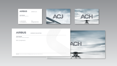
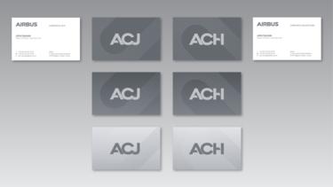
Logo

The Airbus logo is the core element of our branding. It is important to respect its shape and colours to avoid damage to the Airbus brand. The characters that compose the Airbus logo should never be separated. Any exceptions require explicit authorisation by the Branding department.

The logo is a registered trademark. Its use is restricted to Airbus documents and applications print, on-screen, signage, Airbus products and Airbus merchandising products. Without exception, all other use requires authorisation from the Branding department.
 

Colour

The Airbus logo for Corporate Jets / Corporate Helicopters market sectors is only available in the colour copper. 

Please note when printing the main colour copper, the Pantone metallic 875C should always be applied. Do not print this logo in CMYK. The RGB is set for on-screen applications.

airbus-logo-copper
airbus-logo-black
airbus-logo-white

Exclusion zone

Our logo must always be surrounded by clear space to maintain its impact and importance. 

To regulate this, we have defined an exclusion zone equal to the size of the Airbus “A” around the logo as illustrated. It is important to keep this zone around the logo clear of any graphic elements.

airbus-logo-exclusion-zone.png

Minimum size

The Airbus logo is used in different sizes on a range of applications. Retaining logo reproduction quality and legibility is important, so we have established a minimum size rule.

Measurements are based on the height of the Airbus “A” as illustrated.

For on-screen and digital applications minimum sizes please refer to the on-screen principles.
 

airbus-logo-minimum-size.png

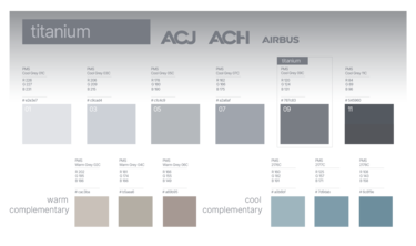
Colours

The categories are:

  1. Main brand colours
  2. Highlight colours

The main brand colours provide recognition and association with Airbus Corporate Jets / Airbus Corporate Helicopters.

Please note when printing the main colour copper, the Pantone metallic 875C should always be applied. Do not print this colour in CMYK. The RGB is set for on-screen applications. 

The highlight colours work as subtle touch points while providing the possibility to highlight selected content. There should be only one highlight colour per page except when using gradients.
 

main-colours-1.png
main-colours-2.png

Typography – Print / Online desktop usage

The Helvetica Neue LT is the corporate typeface for all Airbus applications except online and desktop, where Arial should be used.

The typeface’s roundness and stability reflects Airbus’ modern, high-tech character. The form of the letters gives our company an aerial, structured feel. Its diverse range of weights makes ranking information clear and straightforward.

The Helvetica Neue LT fonts Thin, Light and Bold, should not be used for text set any smaller than 10 points. For sizes less than 10 points, use Roman or Medium fonts.

The Helvetica Neue LT fonts Ultra Light, Heavy and Black should not be used for text set, they are only allowed where typography is used as a design element.

Helvetica Neue LT Condensed should only be used for document signatures, infographics, charts and image captions.

When Helvetica Neue LT is not available or suitable, Arial is authorised as a substitute typeface in certain digital media.

Arial should only be used online and in desktop applications such as Microsoft Word and PowerPoint.

typography.png

Product designation

The aircraft and helicopters type designations on ACJ/ACH liveries are designed in the style of the ACJ/ACH signet typeface.

They are the only graphics beside the ACJ/ACH signet using this typeface.

Besides on the aircraft and helicopters they can be used in graphics and publications as well as in the Title block. They should not be integrated in body text.

For additional aircraft and helicopters type designations please contact the Brand department.


Colours

For colour usage please use the copper colour. Please note when printing the main colour copper, the Pantone metallic 875C should always be applied. Do not print this Logo in CMYK. The RGB is set for on-screen applications.
 

acj.png
acj350.png
ach160.png
ach-type-designation.png

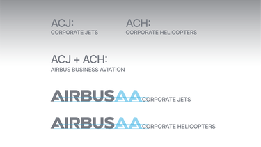
Descriptor

The descriptor is always displayed in combination with the logo and needs to be applied to all touchpoints.

The descriptors are not part of the Airbus logo and as such can vary in position.

  • On stationery and web, the descriptor is sized in proportion to the logo size and aligned on the baseline, whilst respecting the minimum distance to the logo.
  • On editorial collateral, the descriptor is positioned in the top part of the Title block at a fixed size.
  • The visual product designation (ACJ or ACH) is positioned in the left top corner of the title box.
     
acj-ach-descriptor-typeface.png
acj-ach-descriptor-sizing.png
acj-ach-descriptor-positioning-2.png
acj-ach-descriptor-example.png

Title block

Overview

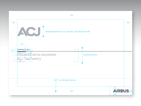
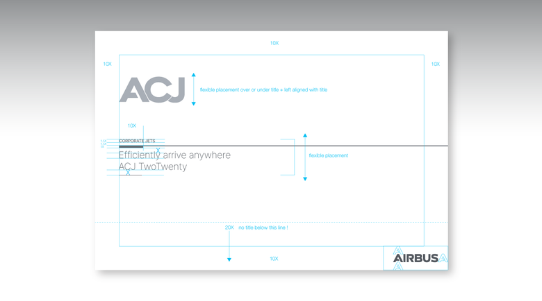
The Title block is one of the basic graphic assets building our visual identity. It is the basis for all cover layouts and enables information to be ranked clearly and stand out properly

It contains the title and other related information, leaving maximum space for pictures and illustrations. The Title block is applicable to all printed collateral.

Title block backgrounds and font colours must be chosen from the main brand colours. No other colours (such as highlight colours) may be used. 

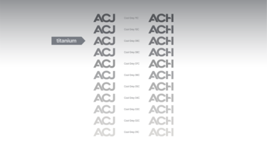
The visual product designation (ACJ or ACH) is positioned in the left top corner of the title box and appears in 60% to 80% saturation. As much transparency as possible should be applied to the Title block background to achieve a sense of lightness.

For more detailed information, please visit the Title block and Brochures and leaflets guidelines.
 

acj-ach-title-block.png

Brochure cover

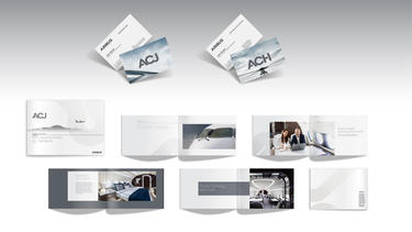
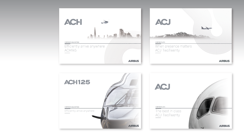
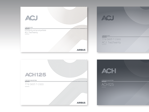
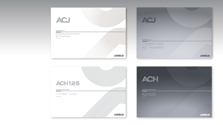
ACJ/ACH brochure covers are composed of the following elements: 

  • the Airbus logo
  • the ACJ/ACH product designation
  • the Title block
  • a full page plain photograph in the background

For more detailed information, please visit the Title block and Brochures and leaflets guidelines.

The covers can also feature photos – in this case the photos should be in a clean, pure and minimalistic style, monochrome tinted in the category’s main colours.
 

acj-ach-title-block-brochure-1.png
acj-ach-title-block-brochure-2.png
acj-ach-title-block-brochure-3.png
acj-ach-title-block-brochure-4.png
acj-ach-title-block-brochure-5.jpg

Graphic Toolbox

Carbon grid luxe

The Carbon grid is one of the basic graphic assets building our visual identity. It can be applied to any ACJ/ACH layout to give an even more unified look and feel. 

The Carbon grid can be used on plain backgrounds, or even interact with photography or typography.
 

acj-ach-carbon-grid-luxe-1.png
acj-ach-carbon-grid-luxe-5.png
acj-ach-carbon-grid-luxe-4.png

Maps

acj-ach-carbon-maps-1.png
acj-ach-carbon-maps-2.png

Aircraft and Helicopter silhouettes


acj-ach-silhouettes.png


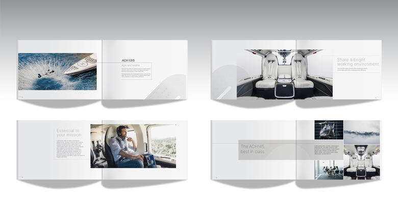
Graphic elements and page layout

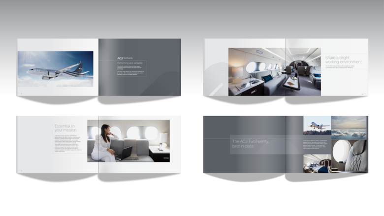
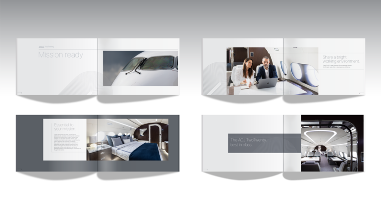
acj-ach-page-layouts-1.png
acj-ach-page-layouts-2.png

Imagery

Aircraft and Helicopter in situation

acj-ach-imagery-situation-2.png
acj-ach-imagery-situation-5.jpg

Interior

acj-ach-imagery-interior-1.png
acj-ach-imagery-interior-2.png
acj-ach-imagery-interior-4.png
acj-ach-imagery-interior-6.png

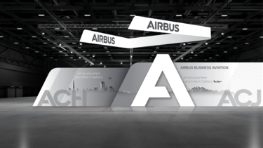
Exhibition

Best practice
acj-ach-exhibition.png

PowerPoint

ACJ
acj-ppt-template-1.png

acj-ppt-template-5.png

ACH

ach-ppt-template-1.png
ach-ppt-template-5.png

Campaign

Best practice
Acj-Chantilly.jpg

Acj-Ach-campaign-2.png