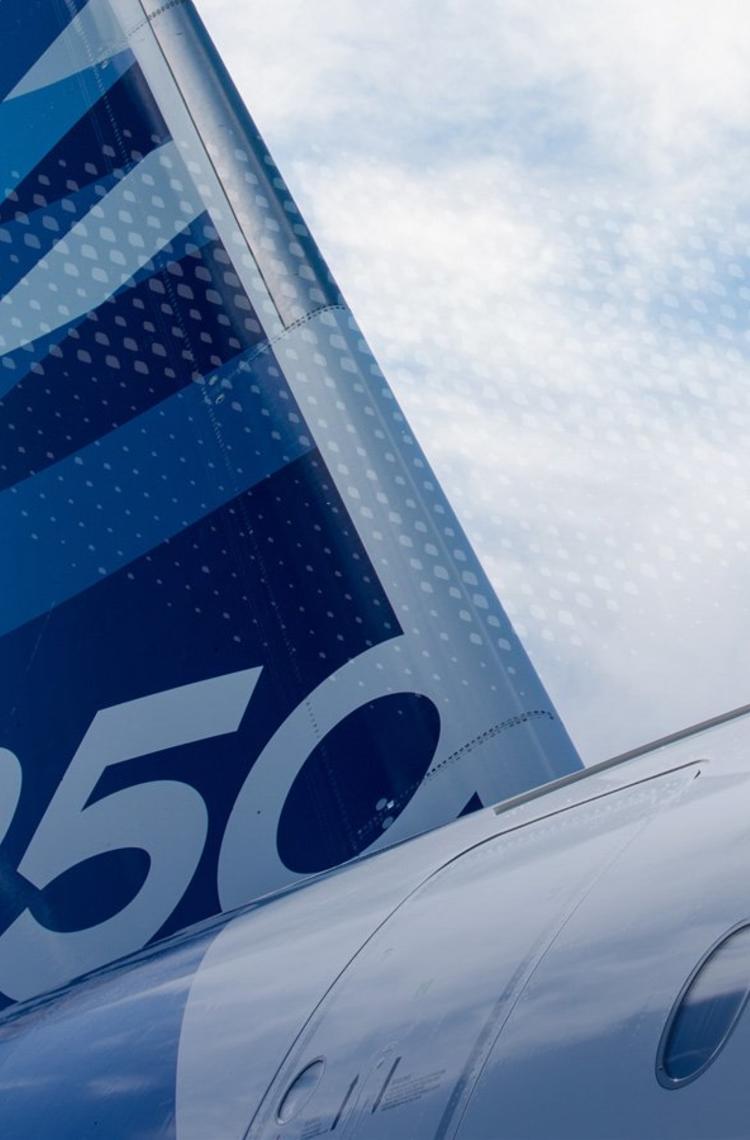
One Airbus brand
The main objectives of the Airbus Brand Governance Organisation is to deliver and implement one Airbus brand and a focused brand architecture in order to support efficient and effective growth and become the leading global company pioneering sustainable aerospace.
We are determined to strengthen our Airbus brand wherever we can. We ensure a coherent execution of the brand across all markets, activities and touch points. Every part of the business will help to build brand equity – and every part will benefit from it. Therefore all worldwide market activities across Commercial Aircraft, Helicopters and Defence and Space plus any future core business entities are all to be branded Airbus.
Therefore, to manage and safeguard Airbus' reputation and brand, you will find in this section all brand guidelines you may need.
By following them, you will support our company's strategic direction in order to build trust, preference and solid relationships. This benefits to our business and our customers' business.
Discover more
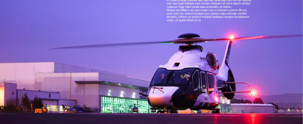
Publish
Guidelines to create communication assets

Product branding
Guidelines related to our products
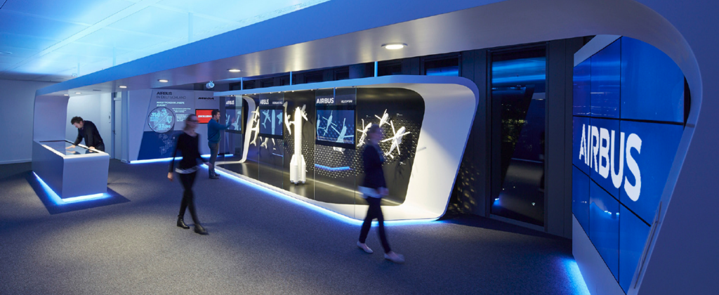
Exhibitions and events
Tools to organise an event

On-site
Guidelines related to the site branding

Imagery and audiovisual
Guidelines to create images and audiovisual assets

Sub-identities
Guidelines for Airbus sub-identities
