Infotainment
What is infotainment?
'Infotainment’ is a type of media intended both to inform and to entertain. Our videos should inform our audiences with relevant content and should also evoke emotion.
We want our Infotainment videos to deliver information in a way that is consistent with the Airbus verbal and visual identity. That means that all videos should be guided by our brand Tone of Voice principles and align with our visual look and feel.
These guidelines show you how to apply our verbal and visual identity to make them recognisably Airbus.
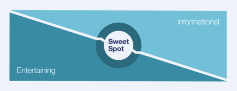
Striking the right balance
In creating an Infotainment video, it is important to strike the right balance. If your video has too much information, your audience may get confused or bored. If your video tries too hard to entertain, key messages may get lost.
Aim for a sweet spot in the middle with the right amount of information delivered in an engaging way.
Infotainment recommendations
Brand Tone of voice
Tone of voice (or ‘verbal identity’) brings to life our brand’s personality in how we speak and write. It keeps our verbal and written communications distinctive, relevant and emotionally engaging.

We have three overarching tone of voice principles that should be used to guide all Airbus communication, including Infotainment.
Below we broadly describe each principle and then provide greater detail and recommendations on how to execute on-brand Infotainment.
Principle 01: We always talk in a Positive and Engaging way
Our belief in what we do and how we do it comes through in our enthusiasm and positivity. We tell stories with authenticity, honesty and subtle emotion.
Principle 02: We always talk in a Clear and Concise way
We speak with certainty and clarity showing understanding and commitment to our business. Less is more. We are succinct and avoid long-winded sentences.
Principle 03: We always talk in a Bold and Dynamic way
There is a strength to our language. We are not afraid to say what we mean or express an opinion or thought. We use dynamic language that conveys our ambition and drive.
Visual elements
Overview
Animation Styles
Kinetic typography
Dynamic type is a good technique to convey messages in an interesting and lively way – especially when the content is very complex or can not be depicted graphically.
Style
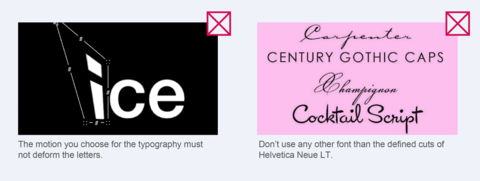
Use the Airbus Corporate type only, Helvetica Neue LT. It has to be set in mixed case. Please refer to the Typography guidelines for more details.
Typography transitions
Kinetic type can fade up, slide in or be animated letter by letter. How you stage the type can relate to the message you want to deliver, it may look technical or emotional. You can strengthen the words by adjusting sizes or kerning. Always make sure that the typography is readable and, if there is one, fits with the voice-over.
Viewing angle
The viewing angle is straight-on.
Colours
On backgrounds that are primarily black or white, type can be any colour from the Airbus colour palette. Make sure that there is enough contrast, so the letters are easy to read.
Simple line animation
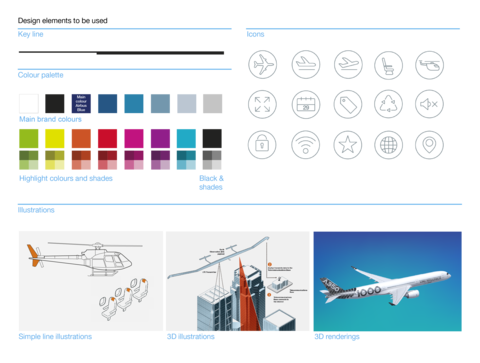
The illustration style conveys information in a very simple way. Please refer to the Icon and Illustration design principles to align with the look and feel of the Airbus brand.
Style
This animation style is based on one line and is drawn in real time. The single line gives the animation a clean, modest and elegant style.
Transitions
All transitions should be a seamless motion between different illustrations and/or frames. When the illustrations morph from one state to another, the lines may get shorter or extend, switch to other shapes, get filled or lead into the next scene.
Viewing angle
The viewing angle is straight-on.
Colours
To ensure that our films are recognisable as Airbus media, you should only use the Airbus colour palette. Use the main brand colours for illustrations and/or backgrounds. The highlight colours and their shades can be used to emphasise content.
3D and rendering animation
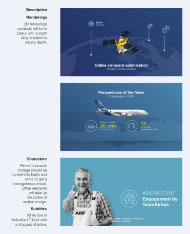
To show more complex content and interaction between elements in the animation use a shaded, three dimensional style. Please refer to the Icon and Illustration design principles to ensure adherence to the look and feel of the Airbus brand.
Style
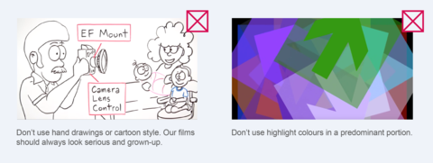
Animated illustrations should either look realistic or depict a refined, line-based graphic style.
Transitions
This style gives many opportunities to create transitions from one object to another or by using different angles.
Viewing angle
The viewing angle varies according to the camera angle.
Colours
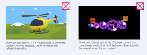
To ensure that our films are recognisable as Airbus media, you should align with the Airbus colour palette whenever it’s possible. For illustrations and shadings the main brand colours and their shades are preferred; the highlight colours and their shades are recommended for accentuating.
Characters design
Scenery and Props
Video integration and rendering
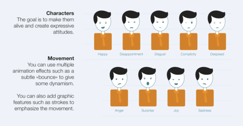
Characters animation
